Sep 30, 2011

Incorrect Username or Password. “OR”?!

You know what I don’t like? I don’t like it when I try to log in to some website with the wrong username or password and they tell me that I have the wrong username or password. What they should tell me is that I have the wrong username, or that I have the wrong password, but not that I have the wrong username OR password. Because then I have to think. I have to ask myself many things: Did I mistype my password? Did I type correctly but try the wrong password? Which email address did I sign up with? Is my username my email address or is it something else? Have I even ever signed up for this site?

It’s like telling me that either my shoelaces are untied or I have something stuck in my teeth. Thanks. Or not. Now, please, tell me what to do.

If they would just tell me, “That username doesn’t exist,” or “Incorrect Password,” then I would have much less to think about. My thoughts would just be, “Oh, I guess signed up with a different email address, or I haven’t registered yet,” or “I must have mistyped my password.” They could tell me which road I’m on, rather than leave me stranded, blindfolded at the crossroads. So why don’t they?

It’s either because they’re lazy and/or mean (which is probably not the case) or because someone has the wrong idea that this is more secure. You don’t want to let an impostor just sit there and try lots of different passwords to get into an account that’s not theirs, and if the impostor doesn’t know whether that username exists or not, then the account is safer—hence the vague error message: “Username or password is incorrect.” Which one is incorrect? It’s a mystery. Except that it’s not. There’s an easy way for anyone to tell if a username exists or not, which is to go to the “Forgot password?” page and enter the username in question. Upon submitting the username, you’ll be told either that “You’ve been sent instructions on how to reset your password,” which means that the username exists or “That username does not exist,” which means that the username does not exist. Because of the “Forgot password?” functionality, the vague error message is not more secure because it’s vague—it’s just more frustrating because it’s vague. There’s no reason for the vagueness. So please, Error Message Writers, just tell me what road I’m on.

If I enter a registered username with the wrong password into Facebook, I see this:
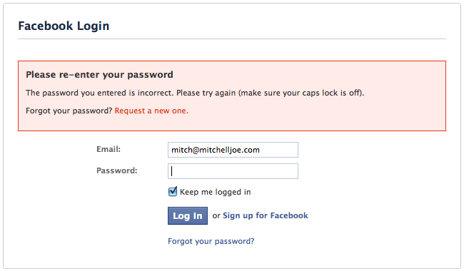
If I enter an unregistered username into Facebook, I see this:

If I enter a registered username with the wrong password into Amazon, I see this:
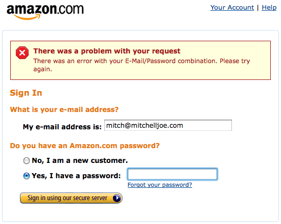
If I enter an unregistered username into Amazon, I see this:
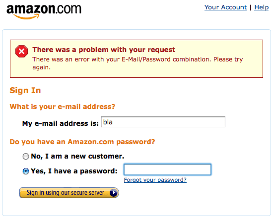
See the difference?


Aug 31, 2011

Too Much Information

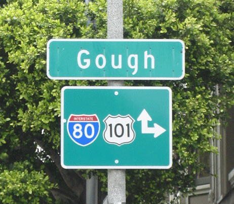
I’m a simple man. I just want to know where to go. Point me in the right direction and I’ll put one foot in front of the other and one day I’ll get there. That’s why I don’t like signs like this:

This sign is very interesting because it’s completely clear what it means and yet it’s confusing. Let’s say I want to get on Highway 101. Before I see this sign, I’m wondering which way to go. After I see this sign, I’m wondering which way to go. This sign tells me to go straight…or to the right. What does that mean, for me? I’m a man of action. What am I supposed to do? It would be fine if it said, “Go straight,” or “Go right,” but when it says, “Go straight or right,” I get a little confused because I am driving only one car and I am a bear of little brain. This isn’t like offering me vanilla or chocolate—it’s like offering me chocolate or chocolate. What kind of nonsense is that?

I know, of course, what it means. It means that the entrance is somewhere in front and to the right of me. But does knowing that I can get there in either of two ways add anything to my driving experience?

I say it detracts and confuses.

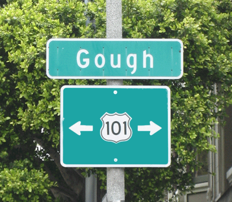
What if things were slightly different? What if the entrance was straight in front of me as the crow flies but there was some obstacle like a big building that cars must go around. In that case, should the sign look like this?

Isn’t that, um, confusing?


Jun 30, 2011

To Pass or Not to Pass Should Not Be a Question

Life is a balancing act. You don’t want to waste any time driving more slowly than you have to, and so it bothers you when you get stuck behind a slow driver on a single lane road, but you also don’t want your impatience to lead to your death caused by a collision with an oncoming car while you are passing the slower driver. To help with balancing act, the Road Makers and Line Drawers have devised a system of lines that communicates to you when you should be patient and when you should pass. This is awesome. Now instead of having just my eyes to rely on, I have this code of solid and dashed lines that lets me know what’s up. This makes me happy. But what I want to complain about is that I could be happier. This system is missing something.

The solid yellow line tells me, “It’s not safe to pass now,” and the dashed line yellow line tells me, “It is safe to pass now,” but there should be another sort of line that is in between the solid and dashed, like a dotted line, that tells me, “It used to be safe to pass but it’s going to be unsafe again real soon, in about 500 yards, so if you’re passing, then you’d better get back on your own side of the road real soon. And if you’re not passing, then don’t start passing now.” There needs to be something akin to a yellow light—something that says to drivers, “The red light is coming soon, so make a decision now.” There should be a dotted line that says, “The solid line is coming soon.” The dashed line doesn’t say that; it just changes abruptly back to a solid line.

Current Situation

  1. This dashed line tells you that it’s safe to start passing.
  2. This dashed line tells you that it’s safe to start passing, but it’s kind of lying. It’s too late to start passing here.
  3. This solid line tells you that it’s not safe to start passing.


Ideal Situation

  1. This dashed line tells you that it’s safe to start passing.
  2. This dotted line tells you that it’s safe to finish passing here but it’s too late to start passing here.
  3. This solid line tells you that it’s not safe to start passing.


When we cross the street as a pedestrian, this middle state also exists. The white light man tells us, “It’s safe to start walking now,” and the red hand tells us, “It’s not safe to be walking now,” and the blinking red hand tells us that we’re in between. It tells us, “It’s not safe to start walking now but if you’re already in the street, it’s safe to keep walking.” The Traffic People have even added a countdown of the number of seconds to let you know exactly where in the middle stage you are. That’s nice.

So, People Who Draw the Lines, please add a middle state to the dashed and solid lines, a dotted line, that tells me, “It’s okay to be coming back onto your own side of the road here but don’t start passing now because the part where it’s safe to pass will be ending very soon.” Thank you.


May 26, 2011

Day 1: My password will expire in 10 days.

Sometimes I’m at work, minding my own business, when all of a sudden BAM! I’m interrupted by a popup window that demands my attention and demands a response. It says to me: “Your password will expire in 10 days. Do you want to change it now?” As you may recall from my previous blog post, or from any previous encounter with me, I don’t like doing anything that I don’t absolutely have to. I’m not lazy, but why should I do anything that I don’t have to? So let me think about this…my password will expire in 10 days, do I want to change it now? Well, no, I want to change it 10 days from now, when I have to. So I click “No”. For 10 days. For 10 days they ask me this. Why?

It’s as annoying as if my car were to say to me, “Hey, you’ve got a 1/4 tank left, do you want to get gas now?” No, car, because I’m the type of person who likes to wait as long as possible before filling up, because waiting as long as possible means I spend less of my lifetime at gas stations filling up my car with gas. I don’t get gas when it’s a 1/4 full for the same reason that I don’t get gas when it’s 3/4 full: I have enough.

If my trash can said to me, “The trash will be full in 10 days, at which point you will have to empty it, would you like to empty it now?” then I would look at it strangely, and not just because it was talking to me. Why would I want to empty the trash 10 days before I had to?

With this popup, changing your password is a lose-lose situation. If you change it early, then you have to change your password more often—Who wants to do that?—and if you change it later, then you have to spend 10 moments of 10 days saying, “No, I want to change my password as infrequently as possible,” and who wants to waste 10 moments of their life doing that?

Not me.

So, People Who Make This Password Expiring Popup: I’m not happy. You know what to do.


Apr 26, 2011

Don’t die typing ‘Aristotle’! OR How to Save a Little Time in Microsoft Word

If you’re like me, then you don’t like doing anything that you don’t have to. I want my shoes to be secured on my feet without having to tie any shoelaces, I want the lights to turn on without having to flip any switches, and I want my toothbrush to do the brushing part for me. Who wouldn’t? That’s why I like Microsoft Word. You heard me. I like Microsoft Word because it automatically corrects my typos—for example, it changes ‘teh’ to the intended ‘the’—and, with some coaxing, it finishes my sentences for me. Well, to be precise, it finishes my words for me. No one likes to waste time. Time is life and who would want to waste life? Not me. So why waste even the time that it takes to type the word ‘the’ when instead of typing three letters you could be typing just one?

I want to share a trick with you that my friend, Peter, showed me in college. He was taking notes and I noticed that he could type the word ‘Aristotle’ a lot faster than I could. He typed ‘aa’ and it magically changed into ‘Aristotle’. Magic! I love magic! He had cunningly added some additional words to Word’s auto-correct list, so that as well as automatically changing ‘teh’ to ‘the’, it now also automatically changed ‘aa’ to ‘Aristotle’. I thought, “Awesome! Now I won’t die typing the word ‘Aristotle’!”. Now perhaps you’re thinking that you don’t type the word ‘Aristotle’ all that often—no problem, you (u) can still save time (ti) by putting other (ot) words into Word. I put in things (ths) like (lk) this:

u = you
ur = you’re
yr = your
w = with
wo = without
bc = because
hv = have
imp = important
cd = could
wd = would
sh = should
cdn = couldn’t
sm = some
th = thing
ths = things
sth = something
ath = anything
eth = everything

This saves me a lot of time.

wt = what
wd = would
u = you
rth = rather
type? = type?

Pretty cool, huh?

Watch:

Unable to display content. Adobe Flash is required.

Mar 15, 2011

Kitchen Ninjas vs Paper Towels

Happy: Isn’t it nice how when you grab a tissue out of the box, it’s not attached to the next tissue? And isn’t it nice how it magically replaces itself by bringing up the next tissue? Yes, it is. That’s nice.

Hypothetical Complainy: Wouldn’t it be annoying if when you grabbed a tissue, it was attached to the next one and you had to separate them by tearing them apart? If they were like paper towels—wouldn’t that be annoying? Yes, it would be.

Real Complainy: Isn’t it annoying that paper towels are like paper towels? I usually need only one, just like tissues. And when I go to grab one, it’s attached to the next one. Annoying. And it’s on a roll! Rolly annoying. So then I have to tear one off in a skillful way, so as to keep the roll from unraveling. Even the most skilled human must admit that this is more difficult than grabbing a tissue.

If I am not a kitchen ninja and I don’t quite trust my one-handed tearing-without-unraveling skills, then I might use my other hand to hold the roll firmly in place while I tear. But if my hands are dirty—which they often are when I want a paper towel, and I don’t want to dirty up the next paper towel by touching it, then instead of using my other hand I will use my elbow to hold the roll in place while I tear one off. Yes, my elbow. Very user-friendly. I am pretty sure that this is not what elbows are for. So now I am elbow-hugging a roll of paper towels as unnaturally as anyone, looking silly as can be—silly enough that Someone ought to ask, in an innocent but annoyed and authoritative way, “Why do they come attached to each other on a roll?! Why don’t they come in boxes like tissues?”


Mar 4, 2011

Calling My Silent Phone

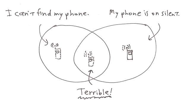
Sometimes I put my phone on silent. And sometimes I can’t find my phone. When these two things happen in conjunction with each other, it’s Terrible.

If my phone is on silent but I can see it, no problem. If I can’t see it but I can hear it, no problem. But if I can’t see it AND I can’t hear it, then it’s Terrible because I can’t call myself from someone else’s phone and then hear my phone ring and find out that it’s behind the couch or in the pocket of the jacket that I wore last night, because my phone won’t make any noise.

When my phone is on silent and I set the alarm, the phone doesn’t ring when someone calls, but it still makes a sound when it’s time for the alarm to go off. That’s nice. A silent alarm wouldn’t be much help. What’s also not much help is when my phone doesn’t make any noise when I’m trying to call it in order to find it. So it would be nice if The People Who Make Phones would make it so that my phone would make some noise when I’m trying to find it. That would be a smart phone. Perhaps they could do this by having a rule that if my phone was called by the same number 3 times within 3 minutes, then the 3rd time it would start to ring normally and not silently. Or maybe I could send a text to my phone that said, “Hey, I’m trying to find you. Please unsilence yourself.” Or maybe the text message would be just “unsilence”. Then I could find my phone.

Wouldn’t that be nice?

I wish the title of this article could be “How to Unsilence Your Phone”. Step 1: Send yourself a text message that says “unsilence”. Instead, it’s 2 steps. Step 1: Write a blog post. Step 2: Wait.


Feb 28, 2011

Blinded from the Side

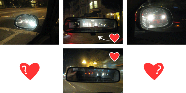
I’m a big fan of the gal or guy who made that flippy switch on my rear view mirror so that when the car behind me has their high beams on, or just has really bright headlights, I can flip the switch and my eyes can sing, “La la la,” to the brightness behind me that has now been dimmed thanks to this Magic Switch. Thank you, Inventor of the Magic Switch!

Now, I don’t mean to sound ungrateful—because I’m not, but I’m just going to throw this into the World’s Suggestion Box since it’s not full yet: I have no idea how magic things work but it seems to me that the Magic Switch that’s on my central rear view mirror could be magically placed on my side rear view mirrors too and that I might be able to control them magically from inside my car, so that the bright headlights of the cars in my side rear view mirrors could be magically dimmed as well. Again, I’m not ungrateful—I’m just not understanding so well the limits of magic. I would like magic everywhere. Left, right, and center. Please.


Feb 15, 2011

Lufthansa’s Calendar Widget

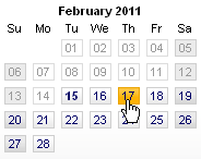
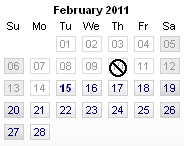
I’m good at figuring stuff out, but I’m even better at not figuring stuff out. I’d rather not have to figure stuff out if I don’t have to, which is why I like Lufthansa’s calendar widget. You heard right—Lufthansa’s calendar widget—that is the subject of today’s blog post. Why do I like it? Let me count the ways. I like it because when I start to act on my desire to travel backwards in time (which not even the best German airlines can do) and I hover over a date that occurs in the past, the cursor changes from the link-clicking hand to an off-limits symbol. Like so:


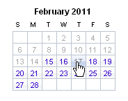
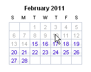
On other airlines’ calendar widgets, like United’s, the cursor changes from a link-clicking hand to an arrow. Like so:


This is bad because the arrow cursor can and often does click on things and often after it clicks on things, something happens. But nothing’s going to happen here, and we’re going to have to figure that out for ourselves either by clicking and then noticing that nothing happened (look at all this extra effort—clicking, noticing) or by noticing that the cursor has changed to “something other than the link-clicking hand” and so probably nothing is going to happen if we click. Probably. What I like about Lufthansa’s choice of the off-limits cursor is that there’s no doubt as to what it means. There is no “probably” here, no millisecond of wondering. It doesn’t make you pause to figure anything out by yourself, it just says right away, “Hey buddy, there will be no clicking here.” I’m special, but even I can’t travel backwards in time and Lufthansa makes this immediately obvious to me. For this, I am giving them a gold star. Danke schön, Lufthansa, for removing a millisecond of wondering from my life.


Feb 3, 2011

On Opening Doors

They say that when a door closes, a window opens. But sometimes when a door closes, you want to open it up again. And sometimes you’re in the dark. And for this reason some people carry little flashlights on their key chains, while other people just fumble around in the dark for a few silent moments of their lives. I am in this second group of people because I don’t want any more stuff on my key chain weighing me down. But I also don’t like fumbling around in the dark. I mean, what if I died while I was doing this? What kind of life is that? “Man dies while trying to open door in the dark.” Miserable, that’s what kind of life it is. This has got to stop. Now.

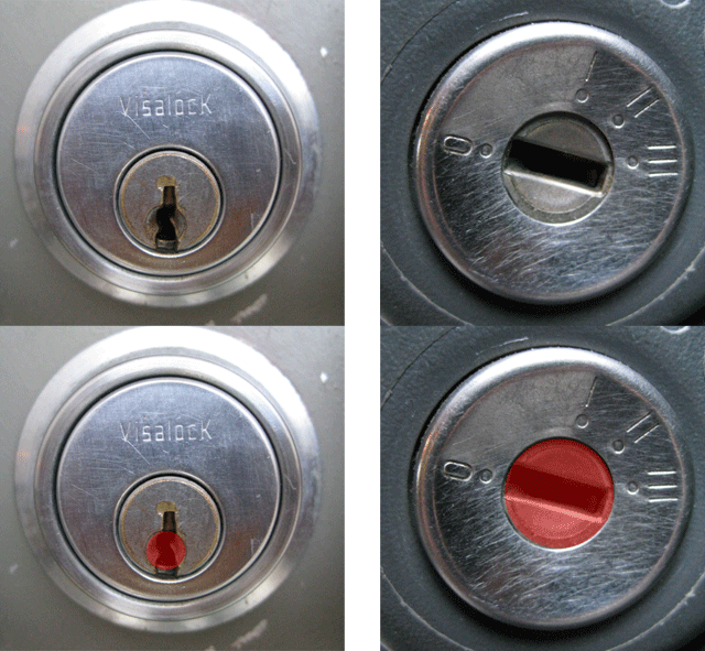
I know what my house key feels like, so finding the right key isn’t a problem for me. My problem is that I can find my key and the door handle alright, but putting the key into the keyhole in the dark is a bit of a challenge. It’s maybe a 2-3 second challenge, but it’s a challenge nonetheless and who needs more challenges in their life? Not me. In the light of day, I have examined my door keyhole and concluded that the reason that it’s hard for the key to find the keyhole in the dark is that the area around the keyhole is more or less flat. This means that your key has to be directly in front of the keyhole in order to go in. In the dark, this is difficult. It’s like being blindfolded and trying to hit a piñata the size of a keyhole with a bat the size of a key. Good luck. If you look really closely at the area around the keyhole, you can see that it is not entirely flat—there is a very small cone-shaped indentation that helps guide the very tip of the key into the keyhole. This helps a little. A little. But I want to be helped a lot. Strangers help a little. Friends help a lot. Door keyholes are user-strange not user-friendly.

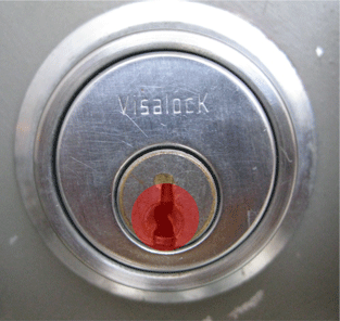
Compare the size of the concave area around a door keyhole with the size of the concave area around a car ignition keyhole:

Have you ever noticed that you’ve never had much trouble putting a car key into the ignition in the dark? You probably don’t even look at the car ignition keyhole because you don’t need to. That’s because car ignition keyholes give the user much more room for error. Instead of a 1/4-inch diameter concave indentation, you get a 1/2-inch diameter concave indentation as your target. Why isn’t opening a door in the dark as easy as starting a car in the dark? We should make door keyholes like car ignition keyholes.

They should make the concave area on doors this big:

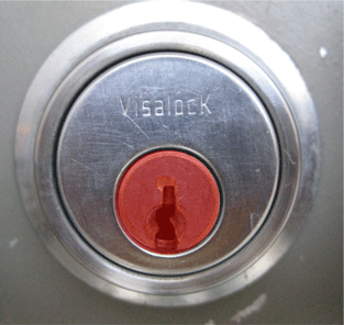
Or, if they wanted to be super user-friendly, they could make the concave area this big:

Then when a door closes, we could open it back up again. The window of opportunity that we should be climbing through is at the front door.

Knock, knock.